
Pixel Art Color Theory
At 32 pixels wide there is no room for timid color. Three ideas — value, hue discipline and contrast — carry almost every good sprite.
Value does the work, hue gets the credit
Squint at any strong sprite and the shading still reads: light side, shadow side, accent. That is value (how light a color is), and it matters more than which hue you pick. Test every sprite in grayscale: if the forms survive, your values are right; if everything merges into gray soup, no hue will save it.
Small ramps beat big gradients
A ramp is a short ordered run of one material — skin, cloth, metal — usually 3 to 5 steps from shadow to light. Build ramps, not gradients: pick the darkest shadow, the lit mid, one highlight, and only then consider in-betweens. Share steps between materials and your 12-color sprite quietly becomes 3 ramps. Fewer steps also quantize cleaner if the art ever passes through a converter.
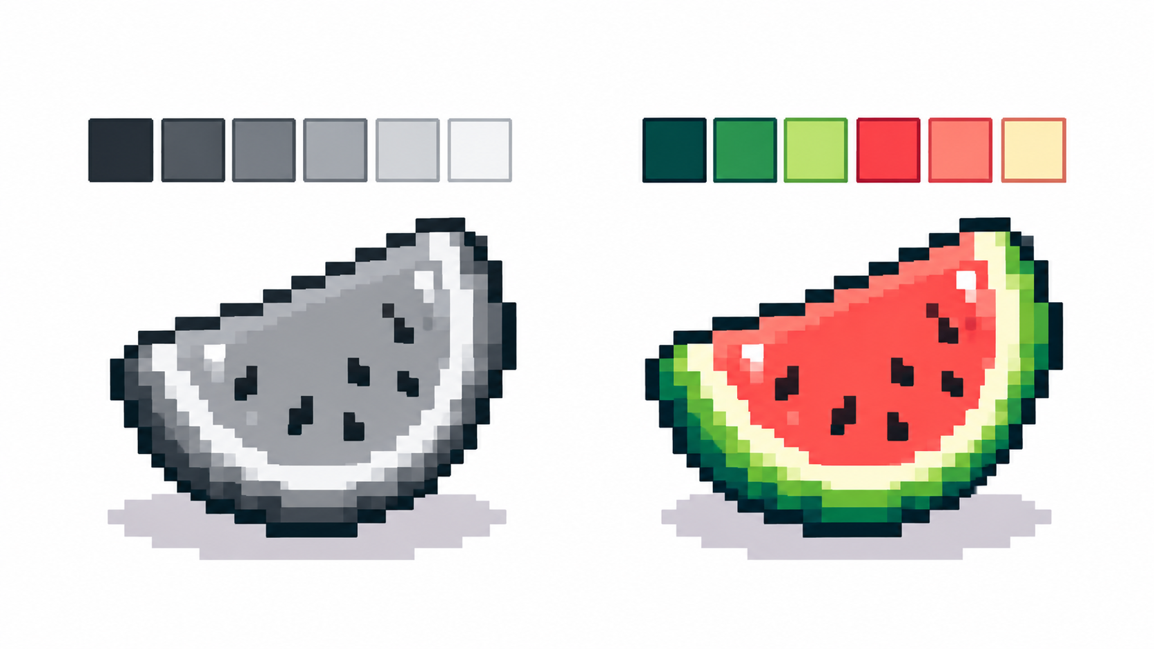
Hue shifting: shadows lean cool, lights lean warm
Real beginners shade by adding black and highlight by adding white, which makes mud and chalk. Instead, shift the hue as value changes: shadows drift toward blue/purple, lights toward yellow/orange. A red cloak’s shadow becomes maroon-purple; its highlight, warm orange-red. Same value range, far richer read — with zero extra colors if you move existing ramp steps instead of adding new ones.
Contrast where it counts
Small art lives on silhouette contrast: the sprite must separate from its background at a glance. Reserve your strongest light-dark jump for the outline-to-background edge and the focal point (usually the face), and let secondary areas share closer values. When everything shouts, nothing reads.

Frequently asked questions
How many colors does color theory need?
Theory first, count second. Most sprites apply these ideas in 4–16 colors; the count is a budget, not a style.
What is hue shifting?
Moving shadows toward cool hues and lights toward warm ones instead of only darkening/lightening — richer shading without extra colors.
Why do my sprites look muddy?
Almost always weak value separation. Check in grayscale, then widen the light–shadow gap before touching hues.
How do I pick colors that work together?
Build short ramps per material, shift hues instead of only darkening, and cap the count: shared steps across ramps keep sprites coherent.
Ready to draw? Open the Pixel Art Maker