
Pixel Art Color Palettes
Color count is the fastest way to change the mood of pixel art. Fewer colors look more retro; more colors keep photographic detail.
Why fewer colors look better
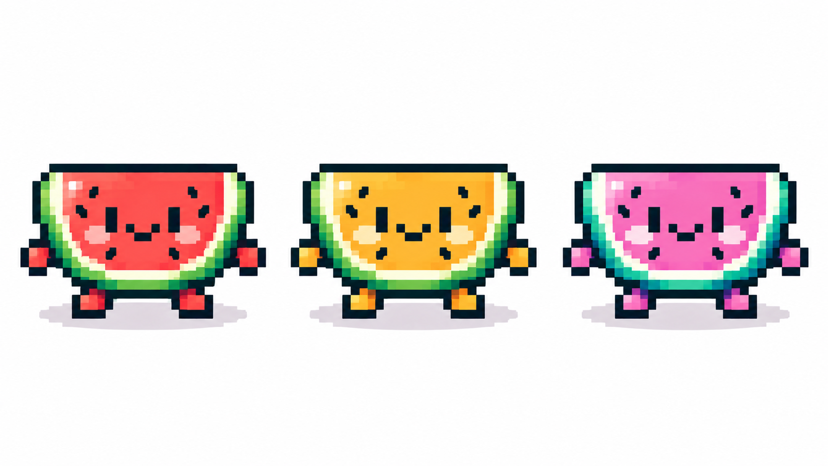
Every extra color is a promise your shading must keep. Small palettes force clear shapes, readable contrast and deliberate ramps — the retro look is mostly just discipline. Start at 8 colors in the converter or 4–8 hand-picked swatches in the maker, and add colors only when a specific area demands one.
Edit swatches, don’t repaint
In the converter, clicking a palette swatch recolors every pixel using it — the fastest edit in pixel art. Sample replacements from the original with Pick from picture, or Auto to recompute from scratch. In the maker, the palette panel collects colors as you draw; prune with − Remove so accidents don’t become permanent residents.
Build tiny ramps, not gradients
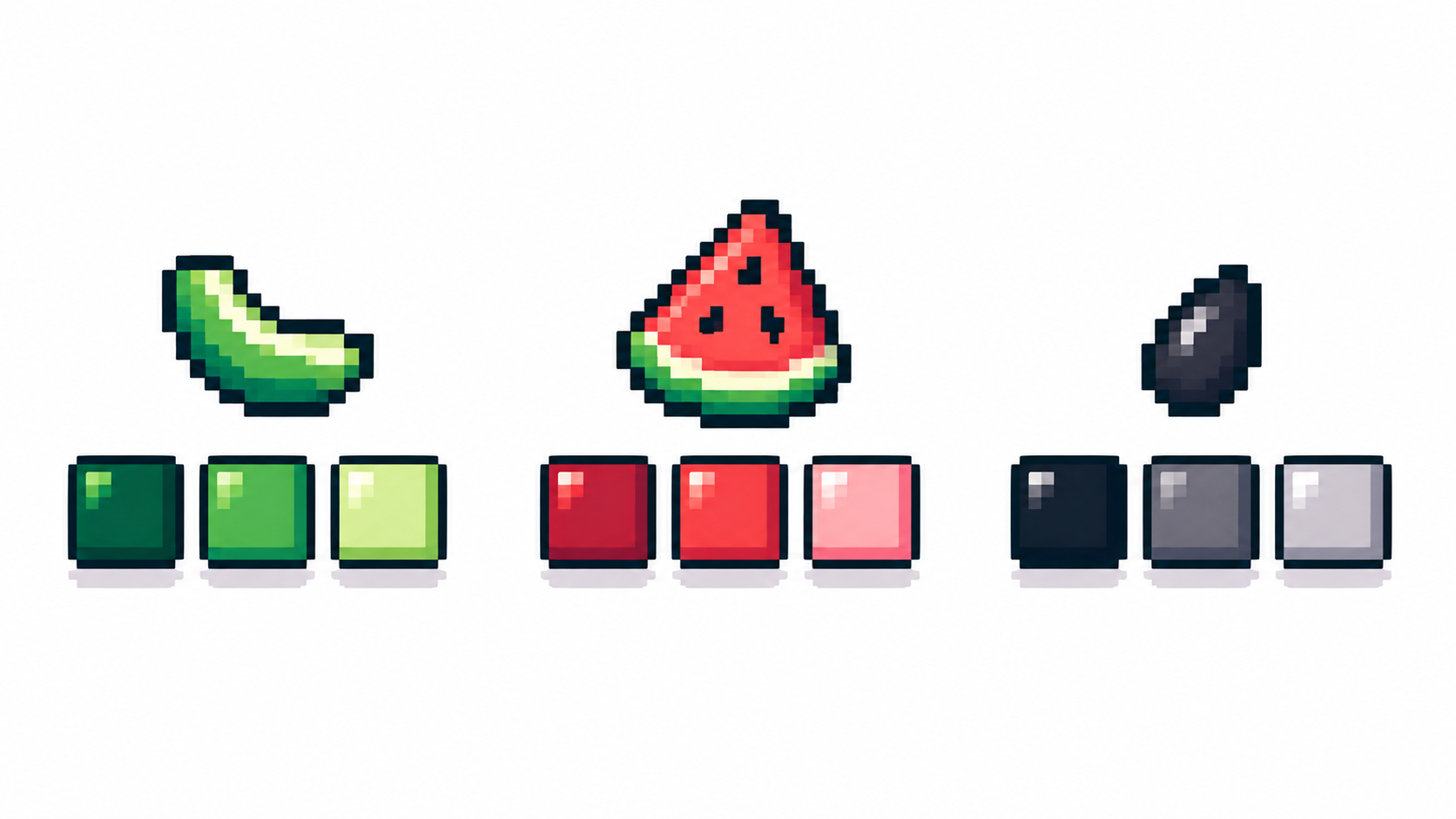
A ramp is 3–4 steps from dark to light per material (skin, cloth, metal). Share steps between ramps where possible — a 12-color sprite often hides only 3 real ramps. Check contrast by squinting: if two steps merge, one of them is wasted.
Grayscale is a feature
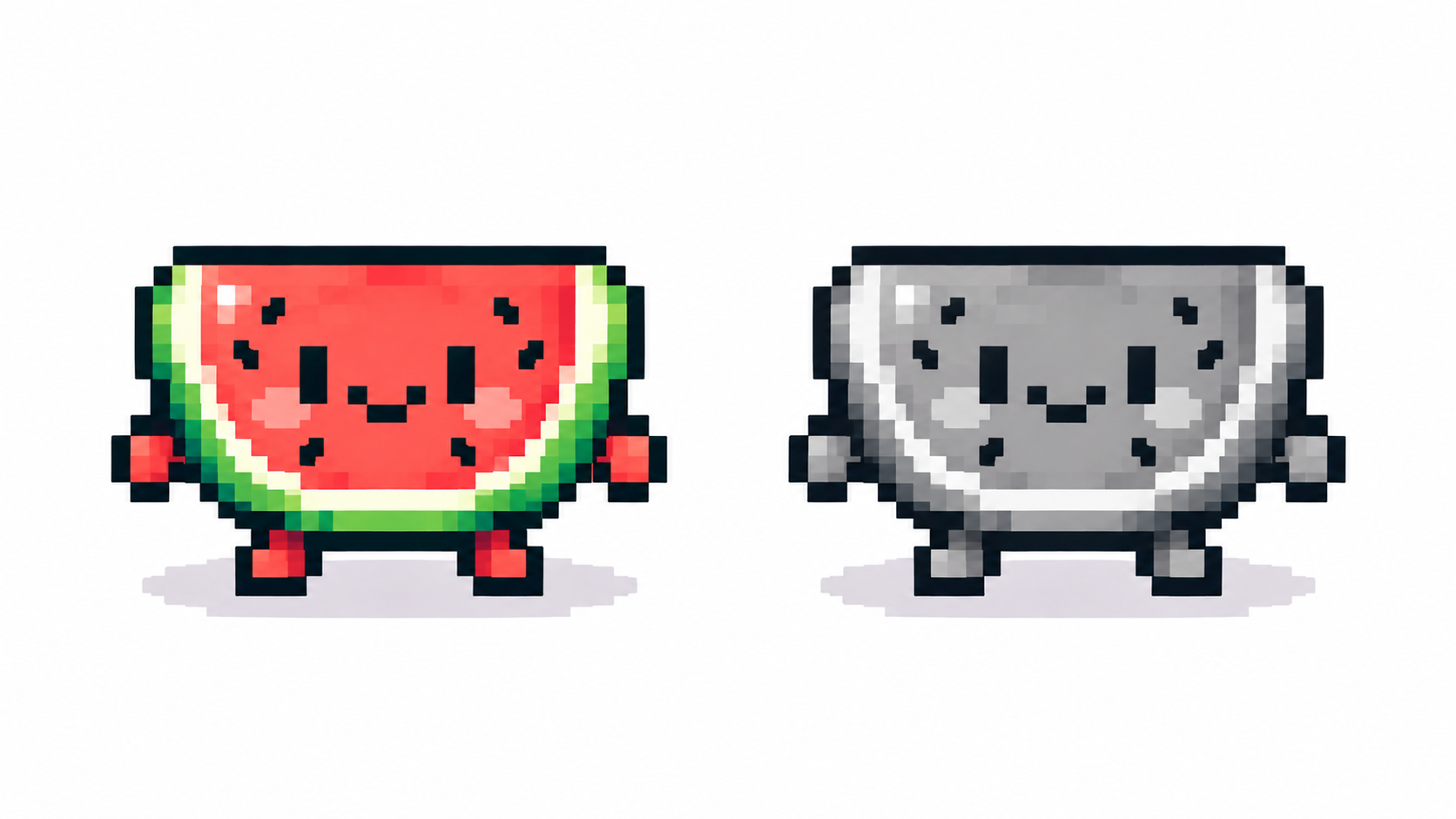
One click removes hue and exposes value problems: muddy shading, flat forms, lost focal points. If art reads well in gray, it will sing in color; if not, no hue will save it. Finish values first, then reintroduce color sparingly.
Frequently asked questions
How many colors does pixel art need?
Most sprites shine at 4–16. Photos converting well usually land at 8–32.
Should I pick colors or use Auto?
Auto for the first pass, then hand-tune the 2–3 swatches that define the mood.
How do I build a color ramp?
Pick the darkest shadow, the lit mid and one highlight per material — three to four ordered steps — and share steps between ramps before adding new colors.
When is grayscale the right choice?
When mood beats hue, or as a checkpoint: if the shading reads without color, the values are right and color will only help.
Ready to draw? Open the Pixel Art Maker